UI Component Tags Documentation
Each tag’s documentation is presented with an attribute table that details the required and optional attributes (including inherited base attributes), any default values or injected settings, and constraints such as allowed parent or child tags.
Common Base Attributes
| Attribute | Description |
|---|---|
| id | Unique identifier for anchoring. |
| display | Layout mode; valid values: "block", "relative", "flex". |
| margin | Shorthand for all margins; supports CSS-like values. |
| margin-x | Horizontal margins (left/right). |
| margin-y | Vertical margins (top/bottom). |
| margin-top | Top margin. |
| margin-right | Right margin. |
| margin-bottom | Bottom margin. |
| margin-left | Left margin. |
| padding | Shorthand for all paddings; supports CSS-like values. |
| padding-x | Horizontal padding (left/right). |
| padding-y | Vertical padding (top/bottom). |
| padding-top | Top padding. |
| padding-right | Right padding. |
| padding-bottom | Bottom padding. |
| padding-left | Left padding. |
| width | Element width; can be a number, "auto", "content", or a percentage (e.g., "50%"). |
| height | Element height; can be a number, "auto", "content", or a percentage. |
| align | Horizontal alignment; valid values: "left", "center", "right". |
| vertical-align | Vertical alignment; valid values: "top", "center", "bottom". |
| x | X-coordinate for relative positioning. |
| y | Y-coordinate for relative positioning. |
| spacing | Gap between items in flex layouts (number). |
| justify-content | Flex layout horizontal distribution; valid values: "flex-start", "flex-end", "center", "space-between", "space-around", "space-evenly". |
| align-items | Flex layout vertical alignment per line; valid values: "flex-start", "flex-end", "center", "stretch". |
| name | Optional element name for setting window names/identifiers. |
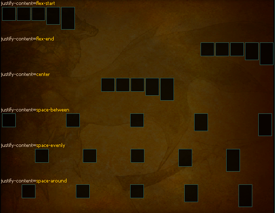
Display Flex - Deep Dive
Here we will cover more in details how display=flex works.
The main attribute you can use with display=flex:
- justify-content which controls horizontal positioning.
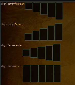
- align-items which controls the vertical alignment of elements in each row.
justify-content Examples
justify-content=<c color="wikititle">flex-start</c>
<inline width="auto" justify-content="flex-start">
    {% for i in range(5) %}
        <thin-board width="30" height="{{ 10 * (i+1) }}" />
    {% endfor %}
</inline>

<spacer></spacer>
justify-content=<c color="wikititle">flex-end</c>
<inline width="auto" justify-content="flex-end">
    {% for i in range(5) %}
        <thin-board width="30" height="{{ 10 * (i+1) }}" />
    {% endfor %}
</inline>

<spacer></spacer>
justify-content=<c color="wikititle">center</c>
<inline width="auto" justify-content="center">
    {% for i in range(5) %}
        <thin-board width="30" height="{{ 10 * (i+1) }}" />
    {% endfor %}
</inline>

<spacer></spacer>
justify-content=<c color="wikititle">space-between</c>
<inline width="auto" justify-content="space-between">
    {% for i in range(5) %}
        <thin-board width="30" height="{{ 10 * (i+1) }}" />
    {% endfor %}
</inline>

<spacer></spacer>
justify-content=<c color="wikititle">space-evenly</c>
<inline width="auto" justify-content="space-evenly">
    {% for i in range(5) %}
        <thin-board width="30" height="{{ 10 * (i+1) }}" />
    {% endfor %}
</inline>

<spacer></spacer>
justify-content=<c color="wikititle">space-around</c>
<inline width="auto" justify-content="space-around">
    {% for i in range(5) %}
        <thin-board width="30" height="{{ 10 * (i+1) }}" />
    {% endfor %}
</inline>
align-items Examples
<inline>
    align-items=<c color="wikititle">flex-start</c>
    <inline width="auto" align-items="flex-start">
        {% for i in range(5) %}
            <thin-board width="30" height="{{ 32 + 10 * (i) }}" />
        {% endfor %}
    </inline>

    <spacer></spacer>
    align-items=<c color="wikititle">flex-end</c>
    <inline width="auto" align-items="flex-end">
        {% for i in range(5) %}
            <thin-board width="30" height="{{ 32 + 10 * (i) }}" />
        {% endfor %}
    </inline>

    <spacer></spacer>
    align-items=<c color="wikititle">center</c>
    <inline width="auto" align-items="center">
        {% for i in range(5) %}
            <thin-board width="30" height="{{ 32 + 10 * (i) }}" />
        {% endfor %}
    </inline>

    <spacer></spacer>
    align-items=<c color="wikititle">stretch</c>
    <inline width="auto" align-items="stretch">
        {% for i in range(5) %}
            <thin-board width="30" height="{{ 32 + 10 * (i) }}" />
        {% endfor %}
    </inline>
</inline>
div
| Attribute | Requirement | Default | Constraints/Notes |
|---|---|---|---|
| Base Attributes | Optional | N/A | Inherits all common base attributes. |
| scrollbar-gap | Optional | — | Used for the scrollable peek window when a fixed height is applied and content overflows. |
| reactive | Optional | — | Comma-separated list of variable names this zone watches. When present, id attribute is required. Enables reactive updates - only this zone re-renders when watched variables change. |
When a div has a fixed height (i.e. its height is not set to "content") and its content exceeds that height, a scrollable peek window is created for all rows after the first one.
Reactive Zones
A div can be marked as a reactive zone by adding the reactive attribute along with a required id attribute. This enables automatic, efficient updates when specific variables change, without re-rendering the entire page.
How it works:
- List the variable names (comma-separated) that this zone depends on in the
reactiveattribute - When any of those variables change via
SetVar()orSetVars(), only this zone re-renders - Scroll position is preserved automatically
- 10-100x faster than full page reload for small updates
Example:
<div id="progress-zone" reactive="mh_1_done,mh_1_need">
    {% set mh_1_done = fun.getv('mh_1_done', 0) %}
    {% set mh_1_need = fun.getv('mh_1_need', 0) %}

    Progress: {{ mh_1_done }}/{{ mh_1_need }}
    <progress max="{{ mh_1_need }}" count="{{ mh_1_done }}" />
</div>
Python usage:
# Update single variable - only the reactive zone updates
loader.SetVar("mh_1_done", 15)

# Update multiple variables - template rendered once, all affected zones update
loader.SetVars({
    "mh_1_done": 15,
    "mh_1_need": 20
})
Requirements:
reactiveattribute must have a correspondingidattribute- Variables listed in
reactiveshould be used within the zone's template - Zone content is rebuilt when watched variables change
main
| Attribute | Requirement | Default | Constraints/Notes |
|---|---|---|---|
| Base Attributes | Optional | N/A | Inherits all common base attributes. |
| scrollbar-gap | Optional | — | As in div. |
| height | Auto-set | "auto" | Forces auto height. |
| width | Auto-set | "auto" | Forces auto width. |
| id | Auto-set | "main" | Sets the element’s identifier to "main". |
| padding | Auto-set | 5 | Default padding value is 5. |
There must be exactly one main per page. It is used by UCHTML as reference to handle url location scroll. **If there is no main, Url location and Anchor href do not work.
lazy-div
| Attribute | Requirement | Default | Constraints/Notes |
|---|---|---|---|
| Base Attributes | Optional | N/A | Inherits all common base attributes. |
| scrollbar-gap | Optional | — | As in div, used for scrollable peek window. |
| preload | Optional | 0 | Determines the number of child elements to preload; additional children are queued. |
lazy-div is useful if we have a lot of similar content (like a grid of items, or monster cards) and we don't want to freeze the client by loading all in one way.
inline
| Attribute | Requirement | Default | Constraints/Notes |
|---|---|---|---|
| Base Attributes | Optional | N/A | Inherits all common base attributes. |
| scrollbar-gap | Optional | — | Same as in div. |
| display | Auto-set | "flex" | Automatically set to "flex" to enable horizontal layout. |
Shortcut for flex <div>.
footer
| Attribute | Requirement | Default | Constraints/Notes |
|---|---|---|---|
| Base Attributes | Optional | N/A | Inherits all common base attributes. |
| width | Auto-set | "auto" | Sets width to auto. |
| vertical-align | Auto-set | "bottom" | Aligns the footer at the bottom. |
Constraints:
- Child Constraint: Must be a leaf element (no children allowed).
Code Example with scrollbar
<footer />
table
| Attribute | Requirement | Default | Constraints/Notes |
|---|---|---|---|
| Base Attributes | Optional | N/A | Inherits all common base attributes. |
| scrollbar-gap | Optional | — | Provides extra gap for the peek window when height is fixed. |
If the table has a fixed height and its content overflows, all rows after the first one are inserted in a scrollable peekwindow.
Constraints:
- Allowed Children: Only
<tr>elements.
Code Example without scrollbar
<table align="center" width="100%">
    <tr>
        <th width="20%">
            -
        </th>
        <th width="60%">
            -
        </th>
        <th width="20%">
            -
        </th>
    </tr>
    <tr>
        <td width="20%">
        </td>
        <td width="20%">
        </td>
        <td width="40%">
            <txt align="center" color="ffdac0a3">
            </txt>
        </td>
        <td width="20%">
        </td>
    </tr>
    <tr>
        <td width="20%">
        </td>
        <td width="20%">
        </td>
        <td width="40%">
            <txt align="center" color="ffdac0a3">
            </txt>
        </td>
        <td width="20%">
        </td>
    </tr>
    <tr>
        <td width="20%">
        </td>
        <td width="20%">
        </td>
        <td width="40%">
            <txt align="center" color="ffdac0a3">
            </txt>
        </td>
        <td width="20%">
        </td>
    </tr>
    <tr>
        <td width="20%">
        </td>
        <td width="20%">
        </td>
        <td width="40%">
            <txt align="center" color="ffdac0a3">
            </txt>
        </td>
        <td width="20%">
        </td>
    </tr>
    <tr>
        <td width="20%">
        </td>
        <td width="20%">
        </td>
        <td width="40%">
            <txt align="center" color="ffdac0a3">
            </txt>
        </td>
        <td width="20%">
        </td>
    </tr>
</table>

<table align="center" width="100%">
    <tr>
        <th width="100%">
        </th>
    </tr>
    <tr>
        <td width="25%">
        </td>
        <td width="25%">
        </td>
        <td width="25%">
        </td>
        <td width="25%">
        </td>
    </tr>
</table>

Code Example with scrollbar
<table align="center" width="100%" height="150">
    <tr>
        <th width="20%">
            -
        </th>
        <th width="60%">
            -
        </th>
        <th width="20%">
            -
        </th>
    </tr>
    <tr>
        <td width="20%">
        </td>
        <td width="20%">
        </td>
        <td width="40%">
            <txt align="center" color="ffdac0a3">
            </txt>
        </td>
        <td width="20%">
        </td>
    </tr>
    <tr>
        <td width="20%">
        </td>
        <td width="20%">
        </td>
        <td width="40%">
            <txt align="center" color="ffdac0a3">
            </txt>
        </td>
        <td width="20%">
        </td>
    </tr>
    <tr>
        <td width="20%">
        </td>
        <td width="20%">
        </td>
        <td width="40%">
            <txt align="center" color="ffdac0a3">
            </txt>
        </td>
        <td width="20%">
        </td>
    </tr>
    <tr>
        <td width="20%">
        </td>
        <td width="20%">
        </td>
        <td width="40%">
            <txt align="center" color="ffdac0a3">
            </txt>
        </td>
        <td width="20%">
        </td>
    </tr>
    <tr>
        <td width="20%">
        </td>
        <td width="20%">
        </td>
        <td width="40%">
            <txt align="center" color="ffdac0a3">
            </txt>
        </td>
        <td width="20%">
        </td>
    </tr>
</table>

<table align="center" width="100%">
    <tr>
        <th width="100%">
        </th>
    </tr>
    <tr>
        <td width="25%">
        </td>
        <td width="25%">
        </td>
        <td width="25%">
        </td>
        <td width="25%">
        </td>
    </tr>
</table>

tr
| Attribute | Requirement | Default | Constraints/Notes |
|---|---|---|---|
| Base Attributes | Optional | N/A | Inherits all common base attributes. |
Constraints:
- Parent Constraint: Must be a direct child of a
<table>. - Allowed Children: Only
<td>and<th>elements.
th
| Attribute | Requirement | Default | Constraints/Notes |
|---|---|---|---|
| Base Attributes | Optional | N/A | Inherits all common base attributes. |
Parent Constraint: Must be placed inside a <tr>.
td
| Attribute | Requirement | Default | Constraints/Notes |
|---|---|---|---|
| Base Attributes | Optional | N/A | Inherits all common base attributes. |
Parent Constraint: Must be placed inside a <tr>.
filter-group.buttons
| Attribute | Requirement | Default | Constraints/Notes |
|---|---|---|---|
| Base Attributes | Optional | N/A | Inherits all common base attributes. |
| type | Required buttons | — | Defines the filter group type. |
| default | Required | — | Specifies the default filter value. Must be one of the <filter> values |
| filter-target | Required | — | Specifies the variable that the filter will set. |
Allowed Children: Only <filter type="button"> and <filter type="dynamic-button">.
filter.button
| Attribute | Requirement | Default | Constraints/Notes |
|---|---|---|---|
| Base Attributes | Optional | N/A | Inherits all common base attributes. |
| type | Required button | — | Filter type; should match parent group. |
| filter-value | Required | — | Value for filtering. |
| path | Required | — | Path template for visual states. |
| tooltip-text | Optional | — | Tooltip text for additional info. |
Parent Constraint: Must be placed inside a <filter-group type=buttons>.
path is expected to be a parametrized path to the images used for normal, over and clicked state.
UCHTML will then substitute normal hover and selected to the parameter of the string.
Example:
path="d:/ymir work/ui/wiki/class_n_{}.tga"
become
d:/ymir work/ui/wiki/class_n_normal.tga
d:/ymir work/ui/wiki/class_n_hover.tga
d:/ymir work/ui/wiki/class_n_selected.tga
And each of the images need to exist in order to render the button.
Code Example
<filter-group display="flex" justify-content="space-evenly" type="buttons" default="packed_query:HELMETS_WARRIOR"
    width="auto" filter-target="#query:race">
    <filter type="button" path="d:/ymir work/ui/wiki/class_w_{}.tga" filter-value="packed_query:HELMETS_WARRIOR">
    </filter>
    <filter type="button" path="d:/ymir work/ui/wiki/class_n_{}.tga" filter-value="packed_query:HELMETS_ASSASSIN">
    </filter>
    <filter type="button" path="d:/ymir work/ui/wiki/class_su_{}.tga" filter-value="packed_query:HELMETS_SURA">
    </filter>
    <filter type="button" path="d:/ymir work/ui/wiki/class_s_{}.tga" filter-value="packed_query:HELMETS_SHAMAN">
    </filter>
</filter-group>
filter.dynamic-button
| Attribute | Requirement | Default | Constraints/Notes |
|---|---|---|---|
| Base Attributes | Optional | N/A | Inherits all common base attributes. |
| type | Required dynamic-button | — | Filter type; should match parent group. |
| filter-value | Required | — | Value for filtering. |
| text | Required | — | Text displayed on the button. |
| tooltip-text | Optional | — | Tooltip information. |
Parent Constraint: Must be placed inside a <filter-group type=buttons>.
Code Example
<filter-group display="flex" justify-content="space-evenly" type="buttons" default="packed_query:HELMETS_WARRIOR"
    width="auto" filter-target="#query:race">
        <filter type="dynamic-button" height=25 width="70" text="foo" tooltip_text="foo" filter-value="foo"></filter>
        <filter type="dynamic-button" height=25 width="70" text="bar" tooltip_text="bar" filter-value="bar"></filter>
        <filter type="dynamic-button" height=25 width="70" text="check" tooltip_text="check" filter-value="check"></filter>
</filter-group>
filter-group.list
| Attribute | Requirement | Default | Constraints/Notes |
|---|---|---|---|
| Base Attributes | Optional | N/A | Inherits all common base attributes. |
| type | Required list | — | Defines the filter group type. |
| default | Required | — | Specifies the default filter value. Must be one of the <filter> values |
| filter-target | Required | — | Specifies the variable that the filter will set. |
Allowed Children: Only <filter type=item>.
Code Example
<filter-group type="tabs" filter-target="query:tab" width="auto" default="info">
    <filter type="tab" height="25" width="100" padding="5" filter-value="info">
        <txt color="wikititle" align="center">Foo</txt>
    </filter>
    <filter type="tab" height="25" width="100" padding="5" filter-value="up">
        <txt color="wikititle" align="center">Bar</txt>
    </filter>
</filter-group>
filter.item
| Attribute | Requirement | Default | Constraints/Notes |
|---|---|---|---|
| Base Attributes | Optional | N/A | Inherits all common base attributes. |
| type | Required item | — | Filter type identifier. |
| filter-value | Required | — | Value associated with the filter item. |
| text | Required | — | Display text for the item. |
| tooltip-text | Optional | — | Additional tooltip info. |
Parent Constraint: Must be placed inside a <filter-group type=list>.
filter-group.tabs
| Attribute | Requirement | Default | Constraints/Notes |
|---|---|---|---|
| Base Attributes | Optional | N/A | Inherits all common base attributes. |
| type | Required tabs | — | Defines the filter group type. |
| default | Required | — | Specifies the default filter value. Must be one of the <filter> values |
| filter-target | Required | — | Specifies the variable that the filter will set. |
Allowed Children: Only <filter type=tab>.
Code Example
<filter-group type="tabs" filter-target="query:tab" width="auto" default="info">
    <filter type="tab" height="25" width="100" padding="5" filter-value="info">
        <txt color="wikititle" align="center">Foo</txt>
    </filter>
    <filter type="tab" height="25" width="100" padding="5" filter-value="up">
        <txt color="wikititle" align="center">Bar</txt>
    </filter>
</filter-group>

filter.tab
| Attribute | Requirement | Default | Constraints/Notes |
|---|---|---|---|
| Base Attributes | Optional | N/A | Inherits all common base attributes. |
| type | Required tab | — | Filter type identifier. |
| filter-value | Required | — | Value used for filtering. |
| height | Required | — | Specifies the height of the tab. |
Parent Constraint: Must be placed inside a <filter-group type=tabs>.
spacer
| Attribute | Requirement | Default | Constraints/Notes |
|---|---|---|---|
| Base Attributes | Optional | N/A | Inherits all common base attributes. |
| height | Optional | 10 | Default height is 10 if not provided. |
| width | Auto-set | "auto" | Width is automatically set to auto. |
Should not contain any child elements.
divider
| Attribute | Requirement | Default | Constraints/Notes |
|---|---|---|---|
| Base Attributes | Optional | N/A | Inherits all common base attributes. |
| pattern | Optional | — | Path for the divider pattern; if not provided, a default pattern is used. |
Should not have any child elements.
Code Example
<divider />
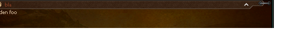
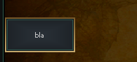
accordion
| Attribute | Requirement | Default | Constraints/Notes |
|---|---|---|---|
| state | Optional | — | Identifier for accordion state. |
| text | Optional | — | Header text. |
| icon | Optional | — | Icon path if applicable. |
| Base Attributes | Optional | — | Inherits all common base attributes. |
Notes:
The accordion element manages a header and toggle state for showing/hiding content. Its header reserves space (with injected padding) to accommodate an icon and text.
Code Example
<accordion width="auto" text="bla" icon="d:/ymir work/ui/game/windows/money_icon.sub">
Hidden foo
</accordion>
carousel
| Attribute | Requirement | Default | Constraints/Notes |
|---|---|---|---|
| Base Attributes | Optional | N/A | Inherits all common base attributes. |
| arrows | Optional | "under" | Arrow placement; valid values: "over" (overlaid on content), "under" (below content). |
| page-var | Optional | — | Variable name to sync current page index with the loader context. Enables external page control. |
A container that shows one <carousel-page> at a time with left/right arrow navigation. The carousel height is determined by the tallest page, preventing layout jumps when switching pages.
Arrow placement:
arrows="under"(default): Arrows appear centered below the content, adding ~25px of extra height.arrows="over": Arrows overlay the content on left/right edges, vertically centered. No extra height.
Arrows are automatically hidden when there is only one page. Navigation wraps around (last page → first page and vice versa).
Allowed Children: Only <carousel-page> elements.
Code Example
<carousel arrows="under" width="auto">
    <carousel-page>
        <h2>Page 1</h2>
        <txt>First page content</txt>
        <slot-item vnum="19" />
    </carousel-page>
    <carousel-page>
        <h2>Page 2</h2>
        <txt>Second page content</txt>
        <slot-item vnum="20" />
    </carousel-page>
    <carousel-page>
        <h2>Page 3</h2>
        <txt>Third page content</txt>
    </carousel-page>
</carousel>
Code Example with page-var
<carousel arrows="over" page-var="current_tab" width="auto">
    <carousel-page>
        <txt>Tab content A</txt>
    </carousel-page>
    <carousel-page>
        <txt>Tab content B</txt>
    </carousel-page>
</carousel>
The page-var attribute syncs the 0-based page index with a loader variable. This allows:
- Reading the initial page from the variable on load
- Updating the variable when the user navigates via arrows
- External components to control which page is shown
carousel-page
| Attribute | Requirement | Default | Constraints/Notes |
|---|---|---|---|
| Base Attributes | Optional | N/A | Inherits all common base attributes. |
A page within a <carousel>. Behaves as a standard div container — any content that can be placed inside a div can be placed inside a carousel-page.
Parent Constraint: Must be placed inside a <carousel>.
board
| Attribute | Requirement | Default | Constraints/Notes |
|---|---|---|---|
| Base Attributes | Optional | — | Inherits all common base attributes. |
| padding | Auto-set | 5 | Default padding is set to 5. |
Minimum size is 64x64.
Code Example
<board width="100" height="100"></board>
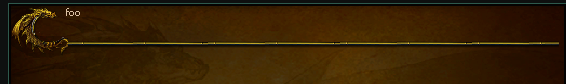
thin-board
| Attribute | Requirement | Default | Constraints/Notes |
|---|---|---|---|
| Base Attributes | Optional | — | Inherits all common base attributes. |
| padding | Auto-set | 7 | Default padding is set to 7. |
Minimum size is 32x32.
Code Example
<thin-board width="100" height="100"></thin-board>
h1
| Attribute | Requirement | Default | Constraints/Notes |
|---|---|---|---|
| Base Attributes | Optional | — | Inherits all common base attributes. |
Code Example
<h1>foo</h1>
h2
| Attribute | Requirement | Default | Constraints/Notes |
|---|---|---|---|
| Base Attributes | Optional | — | Inherits all common base attributes. |
| pattern | Optional | "d:/ymir work/ui/pattern/h1" (or overridden) | Pattern for header row; can be customized. |
Code Example
<h2>foo</h2>
h3
| Attribute | Requirement | Default | Constraints/Notes |
|---|---|---|---|
| Base Attributes | Optional | — | Inherits all common base attributes. |
| pattern | Optional | "d:/ymir work/ui/quest_re/quest_list_line_small" | Pattern for header; can be overridden. |
| pattern_space | Optional | 60 (if not provided) | Reserved space on the right for the pattern. |
| scrollbar-gap | Optional | — | Used when a scrollable peek window is required. |
Code Example
<h3>foo</h3>
Plain Text
Text not enclosed in any tag counts as text.
txt
| Attribute | Requirement | Default | Constraints/Notes |
|---|---|---|---|
| Base Attributes | Optional | — | Inherits all common base attributes. |
| color | Optional | — | Text color; overrides the default font color if specified. |
| font | Optional | — | Font specification (e.g., "Tahoma:13" or "Tahoma:15b"). |
Allowed Children: Only the inline tags: c, hitem, hmob, hraid, hdungeon, hquest, hmap, hyperlink, and br.
color can be an hex color code, which can be 8 characters for ARGB color (e.g.,
FF0000orFFFF0000) or one of Registered color.
c
| Attribute | Requirement | Default | Constraints/Notes |
|---|---|---|---|
| color | Required | — | Specifies the color code for text styling. |
Should not contain any child elements.
color can be an hex color code, which can be 8 characters for ARGB color (e.g.,
FF0000orFFFF0000) or one of Registered color.
Registered Color table
| Name | ARGB |
|---|---|
| black | (0, 0, 0, 255) |
| white | (255, 255, 255, 255) |
| red | (255, 0, 0, 255) |
| green | (0, 128, 0, 255) |
| blue | (0, 0, 255, 255) |
| yellow | (255, 255, 0, 255) |
| cyan | (0, 255, 255, 255) |
| magenta | (255, 0, 255, 255) |
| silver | (192, 192, 192, 255) |
| gray | (128, 128, 128, 255) |
| maroon | (128, 0, 0, 255) |
| olive | (128, 128, 0, 255) |
| purple | (128, 0, 128, 255) |
| teal | (0, 128, 128, 255) |
| navy | (0, 0, 128, 255) |
| lime | (0, 255, 0, 255) |
| aqua | (0, 255, 255, 255) |
| fuchsia | (255, 0, 255, 255) |
| orange | (255, 165, 0, 255) |
| brown | (165, 42, 42, 255) |
| pink | (255, 192, 203, 255) |
| gold | (255, 215, 0, 255) |
| indigo | (75, 0, 130, 255) |
| violet | (238, 130, 238, 255) |
| chocolate | (210, 105, 30, 255) |
| coral | (255, 127, 80, 255) |
| crimson | (220, 20, 60, 255) |
| darkblue | (0, 0, 139, 255) |
| darkcyan | (0, 139, 139, 255) |
| darkgray | (169, 169, 169, 255) |
| darkgreen | (0, 100, 0, 255) |
| darkmagenta | (139, 0, 139, 255) |
| darkorange | (255, 140, 0, 255) |
| darkred | (139, 0, 0, 255) |
| deepskyblue | (0, 191, 255, 255) |
| forestgreen | (34, 139, 34, 255) |
| lightblue | (173, 216, 230, 255) |
| lightgray | (211, 211, 211, 255) |
| lightgreen | (144, 238, 144, 255) |
| lightpink | (255, 182, 193, 255) |
| lightsalmon | (255, 160, 122, 255) |
| lightyellow | (255, 255, 224, 255) |
| wikidefault | (218, 192, 163, 255) |
| wikititle | (255, 199, 0, 255) |
br
A self-closing tag that inserts a line break.
Consecutive lines of Plain Texts, Hyperlinks, <c> Texts and <txt> are concatenated in the same line.
To go newline you have to use <br/>
hitem
| Attribute | Requirement | Default | Constraints/Notes |
|---|---|---|---|
| vnum | Required | — | Must provide an item vnum. |
Should not contain any child elements.
hmob
| Attribute | Requirement | Default | Constraints/Notes |
|---|---|---|---|
| vnum | Required | — | Must provide a mob vnum. |
Should not contain any child elements.
hraid
| Attribute | Requirement | Default | Constraints/Notes |
|---|---|---|---|
| id | Required | — | Must provide a raid identifier. |
Should not contain any child elements.
hdungeon
| Attribute | Requirement | Default | Constraints/Notes |
|---|---|---|---|
| id | Required | — | Must provide a dungeon identifier. |
Should not contain any child elements.
hquest
| Attribute | Requirement | Default | Constraints/Notes |
|---|---|---|---|
| id | Required | — | Must provide a quest identifier. |
Should not contain any child elements.
hmap
| Attribute | Requirement | Default | Constraints/Notes |
|---|---|---|---|
| id | Required | — | Must provide a map identifier. |
Should not contain any child elements.
hyperlink
| Attribute | Requirement | Default | Constraints/Notes |
|---|---|---|---|
| url | Required | — | URL to navigate to when clicked. |
Should not contain any child elements.
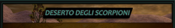
img
| Attribute | Requirement | Default | Constraints/Notes |
|---|---|---|---|
| path | Required | — | Path to the image resource. |
| Base Attributes | Optional | — | Inherits all common base attributes. |
Code Example
<img path="d:/ymir work/ui/wiki/banners/scorpions_dungeon.png" />
button.button
| Attribute | Requirement | Default | Constraints/Notes |
|---|---|---|---|
| type | Required button | — | Button type identifier. |
| target | Optional (either call or target+value must be set) | — | The variable the button will set once clicked. |
| value | Optional (either call or target+value must be set) | — | The value the button will set to the target variable. |
| call | Optional (either call or target+value must be set) | — | The function to call when the button is pressed. Function must be registered in the Jinja Context |
| path | Required | — | Image path template for button states. |
| tooltip-text | Optional | — | Tooltip text. |
| Base Attributes | Optional | — | Inherits all common base attributes. |
path is expected to be a parametrized path to the images used for normal, over and clicked state.
UCHTML will then substitute normal hover and selected to the parameter of the string.
Example:
path="d:/ymir work/ui/wiki/class_n_{}.tga"
become
d:/ymir work/ui/wiki/class_n_normal.tga
d:/ymir work/ui/wiki/class_n_hover.tga
d:/ymir work/ui/wiki/class_n_selected.tga
And each of the images need to exist in order to render the button.
Code Example
<button type="button" path="d:/ymir work/ui/wiki/class_s_{}.tga" target="bar" value="123" />
<button type="button" path="d:/ymir work/ui/wiki/class_s_{}.tga" call="interfacemodule.OpenSomething('argument') />
button.dynamic
| Attribute | Requirement | Default | Constraints/Notes |
|---|---|---|---|
| type | Required dynamic | — | Button type identifier. |
| target | Optional (either call or target+value must be set) | — | The variable the button will set once clicked. |
| value | Optional (either call or target+value must be set) | — | The value the button will set to the target variable. |
| call | Optional (either call or target+value must be set) | — | The function to call when the button is pressed. Function must be registered in the Jinja Context |
| text | Required | — | Display text on the button. |
| width | Required | — | Button width. |
| height | Required | — | Button height. |
| Base Attributes | Optional | — | Inherits all common base attributes. |
Code Example
<button type="dynamic" height=50 width="100" text="bla" target="foo" value="packed_query:HELMETS_SHAMAN" />
<button type="dynamic" height=50 width="100" text="bla" call="interfacemodule.OpenSomething('argument') />
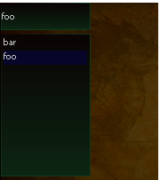
bullet-list
| Attribute | Requirement | Default | Constraints/Notes |
|---|---|---|---|
| Base Attributes | Optional | — | Inherits all common base attributes. |
| bullet-path | Optional | "d:/ymir work/ui/wiki/arrow_2.tga" | Path to the bullet image; default provided if not specified. |
Code Example
<bullet-list>
foo
</bullet-list>
<bullet-list>
bar
</bullet-list>
slot-item
| Attribute | Requirement | Default | Constraints/Notes |
|---|---|---|---|
| vnum | Required | — | Item identifier. |
| count | Optional | 1 | Quantity; defaults to 1 if not provided. |
| sockets | Optional | — | Sockets data, evaluated from string to list/tuple if provided. |
| values | Optional | — | Values data, evaluated from string to list/tuple if provided. |
| Base Attributes | Optional | — | Inherits all common base attributes. |
Code Example
<slot-item vnum="101", count="2" values="[100, 100, 100, 100]"/>

slot-skill
| Attribute | Requirement | Default | Constraints/Notes |
|---|---|---|---|
| vnum | Required | — | Skill identifier. |
| grade | Required | — | Skill grade. |
| level | Required | — | Skill level. |
| Base Attributes | Optional | — | Inherits all common base attributes. |
Skill grade-level conversion
| Grade value | Conventional Level |
|---|---|
0 | 1-20 |
1 | M1-M20 |
2 | G1-G20 |
3 | P |
Code Example
<slot-skill vnum="3" grade="1" level="3"/>
slot-card
| Attribute | Requirement | Default | Constraints/Notes |
|---|---|---|---|
| image | Required | — | Image path for the card. |
| level | Optional | — | Card level. |
| tooltip-text | Optional | — | Tooltip text for additional info. |
| Base Attributes | Optional | — | Inherits all common base attributes. |
Code Example
<slot-card align="center" image="d:/ymir work/ui/skill/pet/pet_skill_7.sub" level="20" tooltip-text="Segugio" />

atlas-info
| Attribute | Requirement | Default | Constraints/Notes |
|---|---|---|---|
| Base Attributes | Optional | — | Inherits all common base attributes. |
| scale-x | Optional | — | Scale factor in the x-direction. |
| scale-y | Optional | — | Scale factor in the y-direction. |
| fit-size | Optional | — | Desired size for fitting content. |
Allowed Children: Only <atlas-waypoint> and <atlas-marker>.
Code Example
<atlas-info map="61" scale-x="0.5" scale-y="0.5" margin-x="17" margin-top="10">
    <atlas-waypoint x="250" y="700" tooltip_text="test waypoint" />
    <atlas-marker x="700" y="250" type="DOMAIN" tooltip_text="test something" />
    <atlas-marker x="400" y="400" type="BOSS" tooltip_text="test foo" />
</atlas-info>
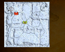
atlas-waypoint
| Attribute | Requirement | Default | Constraints/Notes |
|---|---|---|---|
| x | Required | — | X-coordinate position. |
| y | Required | — | Y-coordinate position. |
| tooltip-text | Optional | — | Tooltip for the waypoint. |
| color | Optional | — | Color specification. |
Parent Constraint: Must be placed within an <atlas-info>.
atlas-marker
| Attribute | Requirement | Default | Constraints/Notes |
|---|---|---|---|
| x | Required | — | X-coordinate position. |
| y | Required | — | Y-coordinate position. |
| tooltip-text | Optional | — | Tooltip for the marker. |
| type | Optional | — | Type of marker lable: BOSS, DOMAIN. |
| color | Optional | — | Color specification. |
Parent Constraint: Must be placed within an <atlas-info>.
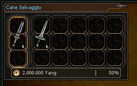
cube-card
| Attribute | Requirement | Default | Constraints/Notes |
|---|---|---|---|
| Base Attributes | Optional | — | Inherits all common base attributes. |
| cost | Optional | — | Cost value. |
| pct | Optional | — | Percentage value. |
| npc | Optional | — | NPC identifier if applicable. |
Allowed Children: Only <cube-result> and <cube-material>.
Code Example
<cube-card npc="101" cost="2000000" pct="50">
    <cube-result vnum="110" count="5"></cube-result>
    <cube-material vnum="121" count="5"></cube-material>
</cube-card>
cube-result
| Attribute | Requirement | Default | Constraints/Notes |
|---|---|---|---|
| vnum | Required | — | Identifier for the cube result. |
| count | Required | — | Count for the result item. |
| Parent Requirement | Required | "cube-card" | Must be placed inside a <cube-card>. |
Parent Constraint: Must be placed inside a <cube-card>.
cube-material
| Attribute | Requirement | Default | Constraints/Notes |
|---|---|---|---|
| vnum | Required | — | Identifier for the cube material. |
| count | Required | — | Count for the material item. |
| Parent Requirement | Required | "cube-card" | Must be placed inside a <cube-card>. |
Parent Constraint: Must be placed inside a <cube-card>.
href.button
| Attribute | Requirement | Default | Constraints/Notes |
|---|---|---|---|
| type | Required button | — | Navigation button type. |
| href | Required | — | URL or anchor target (if it starts with "#", it is treated as an anchor). |
| path | Required | — | Image path template for the button (with state placeholders). |
| tooltip-text | Optional | — | Tooltip text for the button. |
| Base Attributes | Optional | — | Inherits all common base attributes. |
path is expected to be a parametrized path to the images used for normal, over and clicked state.
UCHTML will then substitute normal hover and selected to the parameter of the string.
Example:
path="d:/ymir work/ui/wiki/class_n_{}.tga"
become
d:/ymir work/ui/wiki/class_n_normal.tga
d:/ymir work/ui/wiki/class_n_hover.tga
d:/ymir work/ui/wiki/class_n_selected.tga
And each of the images need to exist in order to render the button.
Code Example
<href type="button" href="" path="d:/ymir work/ui/wiki/class_n_{}.tga"/>
href.text
| Attribute | Requirement | Default | Constraints/Notes |
|---|---|---|---|
| type | Required text | — | Navigation type. |
| href | Required | — | URL or anchor target. |
| text | Required | — | Display text for the link. |
| width | Optional | — | Width specification. |
| Base Attributes | Optional | — | Inherits all common base attributes. |
Code Example
<href type="text" href="" text="Foo"/>
progress
| Attribute | Requirement | Default | Constraints/Notes |
|---|---|---|---|
| max | Optional | 0 | Maximum count value for progress. |
| count | Optional | 0 | Current progress count. |
| color | Optional | "gauge_bpass" | Color for the progress indicator. |
| tooltip-text | Optional | — | Tooltip text (should include two %d placeholders). |
| Base Attributes | Optional | — | Inherits all common base attributes. |
Allowed Children: Only <progress-checkpoint>.
Code Example
<progress width=150 max="10" count="3" tooltip-text="Progress test %d/%d">
    <progress-checkpoint count="5" tooltip-text="Checkpoint at %d"></progress-checkpoint>
    <progress-checkpoint count="7"></progress-checkpoint>
</progress>
progress-checkpoint
| Attribute | Requirement | Default | Constraints/Notes |
|---|---|---|---|
| count | Required | — | Checkpoint count value. |
| tooltip-text | Optional | — | Tooltip info (should contain one %s placeholder). |
Parent Constraint: Must be placed inside a <progress>.
multi-equip-window
| Attribute | Requirement | Default | Constraints/Notes |
|---|---|---|---|
| Base Attributes | Optional | — | Inherits all common base attributes. |
Allowed Children: Only <equip-window>.
Code Example
<multi-equip-window>
<equip-window>
    <equip-part slot="0" vnum="11570" attrs="[(0, 1, 1600, 0), (1, 54, 17, 0), (2, 56, 17, 0)]"
        sockets="[(0, 28342), (1, 28344), (2, 28341)]" values="[(2, 76), (3, 40)]" />
    <equip-part slot="1" vnum="12470" attrs="[(0, 53, 50, 0), (1, 97, 4, 0), (2, 146, 3, 0)]"
        values="[(2, 58), (3, 26)]" />
    <equip-part slot="2" vnum="15190" attrs="[(1, 54, 16, 0), (0, 1, 1600, 0), (2, 56, 16, 0)]" />
    <equip-part slot="3" vnum="14210" attrs="[(0, 1, 1500, 0), (1, 54, 16, 0), (2, 56, 16, 0)]"
        sockets="[(0, 50633), (1, 50633), (2, 50633)]" />
    <equip-part slot="4" vnum="1210" attrs="[(0, 63, 5, 0), (1, 15, 5, 0), (2, 146, 3, 0)]"
        sockets="[(0, 28337), (1, 28345), (2, 28330)]" values="[(1, 147)]" />
    <equip-part slot="5" vnum="16210" attrs="[(0, 1, 1500, 0), (1, 54, 15, 0), (2, 56, 15, 0)]"
        sockets="[(0, 50633), (1, 50633), (2, 50633)]" />
    <equip-part slot="6" vnum="17210" attrs="[(0, 53, 60, 0), (1, 63, 5, 0)]"
        sockets="[(0, 50633), (1, 50633), (2, 50633)]" />
    <equip-part slot="7" vnum="13070" attrs="[(0, 53, 65, 0)]" values="[(2, 88), (3, 45)]" />
    <equip-part slot="8" vnum="100862" />
    <equip-part slot="11" vnum="9071" />
</equip-window>
<equip-window>
    <equip-part slot="0" vnum="11570" attrs="[(0, 1, 1600, 0), (1, 54, 17, 0), (2, 56, 17, 0)]"
        sockets="[(0, 28342), (1, 28344), (2, 28341)]" values="[(2, 76), (3, 40)]" />
    <equip-part slot="1" vnum="12470" attrs="[(0, 53, 50, 0), (1, 97, 4, 0), (2, 146, 3, 0)]"
        values="[(2, 58), (3, 26)]" />
    <equip-part slot="2" vnum="15190" attrs="[(1, 54, 16, 0), (0, 1, 1600, 0), (2, 56, 16, 0)]" />
    <equip-part slot="3" vnum="14210" attrs="[(0, 1, 1500, 0), (1, 54, 16, 0), (2, 56, 16, 0)]"
        sockets="[(0, 50633), (1, 50633), (2, 50633)]" />
    <equip-part slot="4" vnum="2159" attrs="[(0, 63, 5, 0), (1, 15, 5, 0)]"
        sockets="[(0, 28337), (1, 28345), (2, 28330)]" values="[(1, 177)]" />
    <equip-part slot="5" vnum="16210" attrs="[(0, 1, 1500, 0), (1, 54, 15, 0), (2, 56, 15, 0)]"
        sockets="[(0, 50633), (1, 50633), (2, 50633)]" />
    <equip-part slot="6" vnum="17210" attrs="[(0, 53, 60, 0), (1, 63, 5, 0)]"
        sockets="[(0, 50633), (1, 50633), (2, 50633)]" />
    <equip-part slot="7" vnum="13070" attrs="[(0, 53, 65, 0)]" values="[(2, 88), (3, 45)]" />
    <equip-part slot="8" vnum="100862" />
    <equip-part slot="11" vnum="9071" />
</equip-window>
<equip-window>
    <equip-part slot="0" vnum="11770" attrs="[(0, 1, 1600, 0), (1, 54, 17, 0), (2, 56, 17, 0)]"
        sockets="[(0, 28342), (1, 28344), (2, 28341)]" values="[(2, 76), (3, 40)]" />
    <equip-part slot="1" vnum="12610" attrs="[(0, 53, 50, 0), (1, 97, 4, 0), (2, 146, 3, 0)]"
        values="[(2, 58), (3, 26)]" />
    <equip-part slot="2" vnum="15190" attrs="[(1, 54, 16, 0), (0, 1, 1600, 0), (2, 56, 16, 0)]" />
    <equip-part slot="3" vnum="14210" attrs="[(0, 1, 1500, 0), (1, 54, 16, 0), (2, 56, 16, 0)]"
        sockets="[(0, 50633), (1, 50633), (2, 50633)]" />
    <equip-part slot="4" vnum="210" attrs="[(0, 63, 5, 0), (1, 15, 5, 0), (2, 146, 3, 0)]"
        sockets="[(0, 28337), (1, 28345), (2, 28330)]" values="[(1, 119), (0, 97)]" />
    <equip-part slot="5" vnum="16210" attrs="[(0, 1, 1500, 0), (1, 54, 15, 0), (2, 56, 15, 0)]"
        sockets="[(0, 50633), (1, 50633), (2, 50633)]" />
    <equip-part slot="6" vnum="17210" attrs="[(0, 53, 50, 0), (1, 63, 5, 0), (2, 55, 25, 0)]"
        sockets="[(0, 50633), (1, 50633), (2, 50633)]" />
    <equip-part slot="7" vnum="13070" attrs="[(0, 53, 55, 0), (1, 55, 28, 0)]"
        values="[(2, 88), (3, 45)]" />
    <equip-part slot="8" vnum="100862" />
    <equip-part slot="11" vnum="9071" />
</equip-window>
</multi-equip-window>
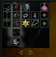
equip-window
| Attribute | Requirement | Default | Constraints/Notes |
|---|---|---|---|
| Base Attributes | Optional | — | Inherits all common base attributes. |
Allowed Children: Only <equip-part>.
Code Example
<equip-window>
    <equip-part slot="0" vnum="11570" attrs="[(0, 1, 1600, 0), (1, 54, 17, 0), (2, 56, 17, 0)]"
        sockets="[(0, 28342), (1, 28344), (2, 28341)]" values="[(2, 76), (3, 40)]" />
    <equip-part slot="1" vnum="12470" attrs="[(0, 53, 50, 0), (1, 97, 4, 0), (2, 146, 3, 0)]"
        values="[(2, 58), (3, 26)]" />
    <equip-part slot="2" vnum="15190" attrs="[(1, 54, 16, 0), (0, 1, 1600, 0), (2, 56, 16, 0)]" />
    <equip-part slot="3" vnum="14210" attrs="[(0, 1, 1500, 0), (1, 54, 16, 0), (2, 56, 16, 0)]"
        sockets="[(0, 50633), (1, 50633), (2, 50633)]" />
    <equip-part slot="4" vnum="1210" attrs="[(0, 63, 5, 0), (1, 15, 5, 0), (2, 146, 3, 0)]"
        sockets="[(0, 28337), (1, 28345), (2, 28330)]" values="[(1, 147)]" />
    <equip-part slot="5" vnum="16210" attrs="[(0, 1, 1500, 0), (1, 54, 15, 0), (2, 56, 15, 0)]"
        sockets="[(0, 50633), (1, 50633), (2, 50633)]" />
    <equip-part slot="6" vnum="17210" attrs="[(0, 53, 60, 0), (1, 63, 5, 0)]"
        sockets="[(0, 50633), (1, 50633), (2, 50633)]" />
    <equip-part slot="7" vnum="13070" attrs="[(0, 53, 65, 0)]" values="[(2, 88), (3, 45)]" />
    <equip-part slot="8" vnum="100862" />
    <equip-part slot="11" vnum="9071" />
</equip-window>
equip-part
| Attribute | Requirement | Default | Constraints/Notes |
|---|---|---|---|
| slot | Required | — | Equipment slot number. |
| vnum | Required | — | Item identifier for the equipment. |
| attrs | Optional | — | Additional attributes; evaluated if provided. |
| values | Optional | — | Values data; evaluated if provided. |
| sockets | Optional | — | Sockets data; evaluated if provided. |
| Parent Requirement | Required | "equip-window" | Must be placed within an <equip-window>. |
Parent Constraint: Must be placed within an <equip-window>.
Slot Index Reference Each slot corresponds to a specific part of the equipment layout:
| Slot | Description |
|---|---|
| 0 | Armor |
| 1 | Helmet |
| 2 | Boots |
| 3 | Wrist/Bracelet |
| 4 | Weapon |
| 5 | Necklace |
| 6 | Earring |
| 7 | Shield |
| 8 | Slot Item 1 |
| 9 | Slot Item 2 |
| 10 | Slot Item 3 |
| 11 | Artifacts |
| 13 | Belt |
| 14 | Manufact (MH) |
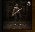
model
| Attribute | Requirement | Default | Description |
|---|---|---|---|
| mob-vnum | Optional | — | Mob identifier; must be provided if item-vnum is not set. |
| item-vnum | Optional | — | Item identifier; must be provided if mob-vnum is not set. |
| camera-move | Optional | false | Boolean-like value enabling camera movement. |
| motion-index | Optional | 0 | Motion index to set. |
| camera-eye | Optional | — | A tuple of three values representing the camera's eye position. |
| camera-target | Optional | — | A tuple of three values representing the camera's target position. |
| camera-up | Optional | — | A tuple of three values representing the camera's up vector. |
| background | Optional | "d:/ymir work/ui/game/myshop_deco/model_view_background.sub" | Path to background image/texture. |
| Base Attributes | Inherited | — | See common base attributes. |
Exactly one of mob-vnum or item-vnum must be provided.
Code Example
<model width="100" height="100" item-vnum="109" camera-move="True" />
Motion Index Reference
The motion-index attribute controls the animation of the model being displayed. These values correspond to the EName enum in the source code.
| Value | Name | Description |
|---|---|---|
| 0 | NAME_NONE | No specific motion. |
| 1 | NAME_WAIT | Waiting or idle motion. |
| 2 | NAME_WALK | Walking animation. |
| 3 | NAME_RUN | Running animation. |
| 4 | NAME_CHANGE_WEAPON | Changing weapon animation. |
| 5 | NAME_DAMAGE | Front damage animation. |
| 6 | NAME_DAMAGE_FLYING | Front flying damage animation. |
| 7 | NAME_STAND_UP | Standing up from front damage animation. |
| 8 | NAME_DAMAGE_BACK | Back damage animation. |
| 9 | NAME_DAMAGE_FLYING_BACK | Back flying damage animation. |
| 10 | NAME_STAND_UP_BACK | Standing up from back damage animation. |
| 11 | NAME_DEAD | Death animation. |
| 12 | NAME_DEAD_BACK | Death animation from a back attack. |
| 13 | NAME_NORMAL_ATTACK | Normal attack animation. |
| 14-21 | NAME_COMBO_ATTACK_1 to NAME_COMBO_ATTACK_8 | Combo attack animations. |
| 22 | NAME_INTRO_WAIT | Intro screen idle. |
| 23 | NAME_INTRO_SELECTED | Intro screen selected. |
| 24 | NAME_INTRO_NOT_SELECTED | Intro screen not selected. |
| 25 | NAME_SPAWN | Spawn animation. |
| 26 | NAME_FISHING_THROW | Fishing rod throwing animation. |
| 27 | NAME_FISHING_WAIT | Waiting for a bite animation. |
| 28 | NAME_FISHING_STOP | Stopping fishing animation. |
| 29 | NAME_FISHING_REACT | Reacting to a bite animation. |
| 30 | NAME_FISHING_CATCH | Catching a fish animation. |
| 31 | NAME_FISHING_FAIL | Failing to catch a fish animation. |
| 32 | NAME_STOP | Stopping motion. |
| 33 | NAME_SPECIAL_1 | Special/NPC motion 1. (skill) |
| 34 | NAME_SPECIAL_2 | Special/NPC motion 2. (skill) |
| 35 | NAME_SPECIAL_3 | Special/NPC motion 3. (skill) |
| 36 | NAME_SPECIAL_4 | Special/NPC motion 4. (skill) |
| 37 | NAME_SPECIAL_5 | Special/NPC motion 5. (skill) |
| 38 | NAME_SPECIAL_6 | Special/NPC motion 6. (skill) |
| 39 | NAME_SPAWN_REMOTE | Server-triggered spawn. |
| 50 | NAME_SKILL | Skill start. |
| 51+ | NAME_SKILL_END | Skill end (variable). |
| 67 | NAME_CLAP | Clapping animation. |
| 68 | NAME_CHEERS_1 | Cheers animation 1. |
| 69 | NAME_CHEERS_2 | Cheers animation 2. |
| 70 | NAME_KISS_START to NAME_KISS_WITH_SHAMAN | Kissing animations. |
| 74 | NAME_FRENCH_KISS_START to NAME_FRENCH_KISS_WITH_SHAMAN | French kissing animations. |
| 78 | NAME_SLAP_HIT_START to NAME_SLAP_HIT_WITH_SHAMAN | Slap hit animations. |
| 82 | NAME_SLAP_HURT_START to NAME_SLAP_HURT_WITH_SHAMAN | Slap hurt animations. |
| 86 | NAME_DIG | Digging animation. |
| 87 | NAME_DANCE_1 to NAME_DANCE_6 | Dance animations. |
| 93 | NAME_DANCE_END | Dance animation end. |
| 103 | NAME_CONGRATULATION | Congratulation motion. |
| 104 | NAME_FORGIVE | Forgive motion. |
| 105 | NAME_ANGRY | Angry motion. |
| 106 | NAME_ATTRACTIVE | Attractive motion. |
| 107 | NAME_SAD | Sad motion. |
| 108 | NAME_SHY | Shy motion. |
| 109 | NAME_CHEERUP | Cheer up motion. |
| 110 | NAME_BANTER | Banter motion. |
| 111 | NAME_JOY | Joyful motion. |
| 112 | NAME_MAX_NUM | Maximum number of motions. |
items-grid
| Attribute | Requirement | Default | Constraints/Notes |
|---|---|---|---|
| vnums | Required | — | List of item identifiers; provided as a string evaluated to a list/tuple. |
| width | Required | — | Grid width; can be a number, "auto", or percentage. |
| height | Required | — | Grid height; can be a number, "auto", or percentage. |
| sort-size | Optional | — | If provided, items are sorted by icon height (descending). |
| Base Attributes | Optional | — | Inherits all common base attributes. |
ItemsGrid accepts only the following formats for the vnums attribute:
[[vnum, count], ...], [vnum, ...], or [{'vnum': vnum, 'count': count}, ...].
Code Example
<items-grid width="250" height="32"
        vnums="[50513, 72724, 72728, 25040, 25041, 72001, 100466, [102626, 10], 102599, 90804]" />
item-stats
| Attribute | Requirement | Default | Constraints/Notes |
|---|---|---|---|
| vnum | Required | — | Identifier for the item whose stats are displayed. |
| width | Auto-set | "auto" | Forces auto width. |
| Base Attributes | Optional | — | Inherits all common base attributes. |
Code Example
<item-stats vnum="10" width="auto" />
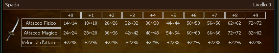
equip-up
| Attribute | Requirement | Default | Constraints/Notes |
|---|---|---|---|
| vnum | Required | — | Identifier for the equipment upgrade info. |
| width | Auto-set | "auto" | Forces auto width. |
| Base Attributes | Optional | — | Inherits all common base attributes. |
Code Example
<equip-up vnum="10" width="auto" />
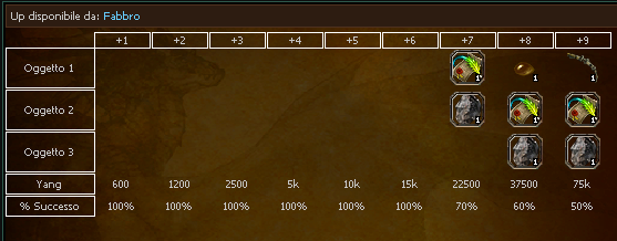
equip-epic-up
| Attribute | Requirement | Default | Constraints/Notes |
|---|---|---|---|
| vnum | Required | — | Identifier for epic upgrade information. |
| Base Attributes | Optional | — | Inherits all common base attributes. |
item-card
| Attribute | Requirement | Default | Constraints/Notes |
|---|---|---|---|
| vnum | Required | — | Identifier for the item. |
| Base Attributes | Optional | — | Inherits all common base attributes. |
Code Example
<item-obtainable-from width="auto" vnum=72725 />

item-obtainable-from
| Attribute | Requirement | Default | Constraints/Notes |
|---|---|---|---|
| vnum | Required | — | Identifier for the item. |
| width | Required | — | Width specification for display. |
| Base Attributes | Optional | — | Inherits all common base attributes. |
Code Example
<item-obtainable-from width="auto" vnum=72725 />
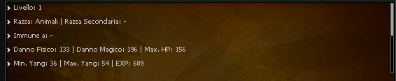
monster-stats
| Attribute | Requirement | Default | Constraints/Notes |
|---|---|---|---|
| vnum | Required | — | Monster identifier. |
| width | Required | — | Display width. |
| height | Required | — | Display height. |
| Base Attributes | Optional | — | Inherits all common base attributes. |
Code Example
<monster-stats width="auto" height=100 vnum=101 />
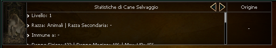
monster-card
| Attribute | Requirement | Default | Constraints/Notes |
|---|---|---|---|
| vnum | Required | — | Monster identifier. |
| tab | Optional | stats | The tab shown as default. Admitted values are stats and drop |
| Base Attributes | Optional | — | Inherits all common base attributes. |
This element internally uses
mob originwhich can be configured in theconfig.yaml.
Code Example
<monster-card vnum=101 />
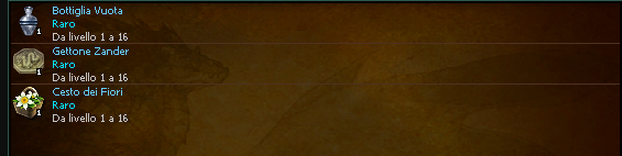
monster-drop
| Attribute | Requirement | Default | Constraints/Notes |
|---|---|---|---|
| vnum | Required | — | Monster drop identifier. |
| width | Auto-set | "auto" | Forces auto width. |
| Base Attributes | Optional | — | Inherits all common base attributes. |
Code Example
<monster-drop width="auto" vnum=101 />
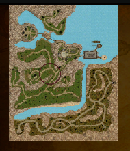
monster-spawn
| Attribute | Requirement | Default | Constraints/Notes |
|---|---|---|---|
| vnum | Required | — | Monster spawn identifier. |
| Base Attributes | Optional | — | Inherits all common base attributes. |
Code Example
<monster-spawn vnum=101/>
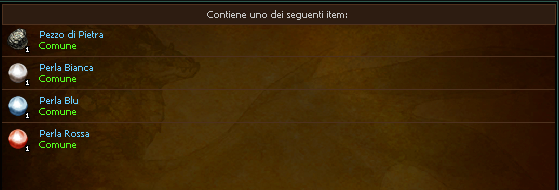
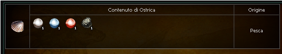
chest-content
| Attribute | Requirement | Default | Constraints/Notes |
|---|---|---|---|
| vnum | Required | — | Identifier for the chest content. |
| width | Auto-set | "auto" | Forces auto width. |
| Base Attributes | Optional | — | Inherits all common base attributes. |
Code Example
<chest-content width="auto" vnum="27987" />
chest-card
| Attribute | Requirement | Default | Constraints/Notes |
|---|---|---|---|
| vnum | Required | — | Identifier for the chest card. |
| Base Attributes | Optional | — | Inherits all common base attributes. |
This element internally uses
item originwhich can be configured in theconfig.yaml.
Code Example
<chest-card width="auto" vnum="27987" />
item-shop-card
| Attribute | Requirement | Default | Constraints/Notes |
|---|---|---|---|
| id | Required | — | Item shop item ID (integer). Must match an item loaded in ItemShopStore. |
| Base Attributes | Optional | — | Inherits all common base attributes. |
Renders a full ItemShopDisplayItem widget (200×145) with icon, name, price, quantity selector, and purchase button. The item data is pulled from ItemShopStore by id. Purchase actions are routed through interfacemodule_wrapper.
Should not contain any child elements. The item shop must be loaded (store populated) before this element renders correctly.
Code Example
<item-shop-card id="7" />
- Common Base Attributes
- Display Flex - Deep Dive
div- Reactive Zones
mainlazy-divinlinefootertabletrthtdfilter-group.buttonsfilter.buttonfilter.dynamic-buttonfilter-group.listfilter.itemfilter-group.tabsfilter.tabspacerdivideraccordioncarouselcarousel-pageboardthin-boardh1h2h3- Plain Text
txtc- Registered Color table
brhitemhmobhraidhdungeonhquesthmaphyperlinkimgbutton.buttonbutton.dynamicbullet-listslot-itemslot-skillslot-cardatlas-infoatlas-waypointatlas-markercube-cardcube-resultcube-materialhref.buttonhref.textprogressprogress-checkpointmulti-equip-windowequip-windowequip-partmodelitems-griditem-statsequip-upequip-epic-upitem-carditem-obtainable-frommonster-statsmonster-cardmonster-dropmonster-spawnchest-contentchest-carditem-shop-card